

Choosing Paint Colors with Confidence
Few design decisions feel as deceptively simple—and carry as much emotional weight—as choosing paint colors. A wall color can elevate architecture, soften light, define mood, and quietly shape how a home feels day after day. Yet for many homeowners, it’s also the point where confidence wavers. Swatches multiply, undertones blur, and what looked perfect in a showroom suddenly feels uncertain at home.
Choosing paint colors with confidence isn’t about finding a “safe” neutral or following trends. It’s about understanding how color behaves, how your home lives, and how thoughtful selection creates cohesion rather than chaos. When approached intentionally, paint becomes one of the most powerful tools in design.
Why Paint Feels So High-Stakes
Paint is everywhere. Unlike furnishings or décor that can be layered over time, wall color sets the backdrop for every other decision. It touches every room, interacts with every material, and is experienced constantly. That permanence—real or perceived—often fuels hesitation.
Adding to the pressure, paint is uniquely sensitive to context. A color that looks warm and creamy in one home may read cool or dull in another. Lighting, ceiling height, trim detail, and surrounding finishes all influence how paint is perceived. What homeowners are often reacting to isn’t the color itself, but how it behaves in their specific environment.
Understanding that paint is relational—not isolated—is the first step toward confidence.
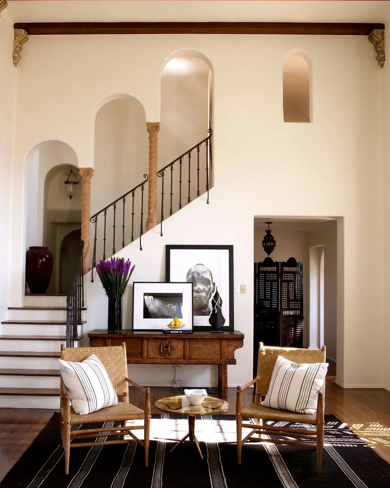
Start with the Architecture, Not the Swatch
Before opening a paint deck, it’s essential to look at the bones of the home. Architecture sets the tone for color selection, whether subtle or bold.
Traditional homes often benefit from softer, layered neutrals that respect existing trim profiles, ceiling heights, and historical detailing. Contemporary homes may lean toward cleaner whites, deeper contrasts, or more saturated tones that complement modern lines. Transitional spaces often live comfortably between the two, allowing for warmth without heaviness.
Paint should never fight the architecture. When color reinforces the style of the home, it feels natural—even timeless.
Light Changes Everything
One of the most overlooked aspects of paint selection is how light transforms color throughout the day. Natural light varies dramatically based on orientation:
North-facing rooms tend to pull cooler and flatter, often muting warm tones.
South-facing rooms receive abundant warm light, enhancing depth and richness.
East-facing rooms feel bright and crisp in the morning, cooler in the afternoon.
West-facing rooms shift dramatically, glowing warm in the evening but feeling subdued earlier in the day.
Artificial lighting plays an equally important role. Warm bulbs can soften whites and warm up grays, while cooler LEDs may emphasize blue or green undertones.
Confident color selection means anticipating these shifts and choosing tones that feel balanced across conditions—not just at one moment of the day.
Understanding Undertones (and Why They Matter)
Two whites can look nearly identical on a paint strip yet feel entirely different on the wall. The difference lies in undertones.
Undertones—subtle hints of yellow, red, blue, green, or gray—determine how a color interacts with surrounding materials. Floors, cabinetry, stone, tile, and even landscaping influence how undertones appear.
For example:
A warm white with yellow undertones may clash with cool marble or gray tile.
A gray with green undertones can feel muddy next to warm wood floors.
A neutral that leans pink may appear dingy in certain light conditions.
Choosing paint with confidence means viewing undertones in context, not isolation. Paint should complement fixed finishes, not compete with them.
The Power of a Cohesive Palette
One of the most common mistakes homeowners make is choosing paint room by room. While each space may feel considered individually, the home as a whole can lose its sense of flow.
A cohesive palette doesn’t mean every room is the same color. It means colors relate to one another—through shared undertones, depth, or temperature. This creates visual continuity and allows the home to feel intentional rather than piecemeal.
Often, confidence comes from narrowing options rather than expanding them. A restrained palette allows each color to shine while supporting the overall narrative of the home.
Neutrals Aren’t One-Size-Fits-All
Neutral doesn’t mean boring—and it certainly doesn’t mean foolproof.
Whites, creams, greiges, and soft grays vary dramatically in warmth and depth. The right neutral should respond to the home’s light, materials, and scale. In some spaces, a crisp white brings clarity and freshness. In others, it can feel stark or unfinished.
Depth matters as much as tone. Slightly deeper neutrals can ground large open spaces, while lighter tones may enhance smaller rooms or areas with limited light.
The key is selecting neutrals that feel intentional, not default.
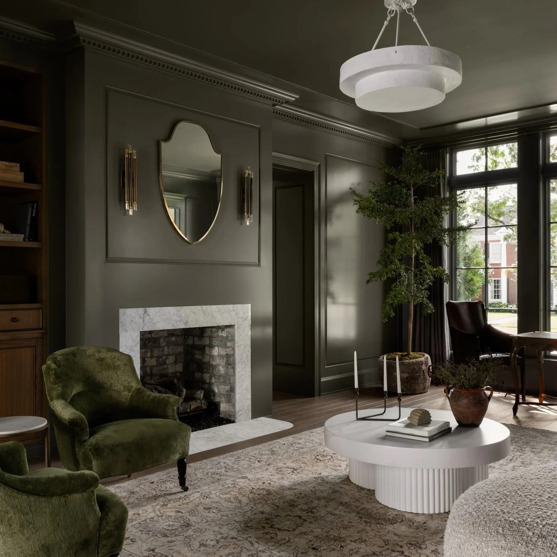
Where Bold Color Belongs
Confidence doesn’t always mean restraint. Bold colors can be incredibly effective when used strategically.
Powder rooms, libraries, dining rooms, and studies often benefit from richer hues that add drama and intimacy. Accent colors can highlight architectural features, define zones, or bring personality without overwhelming the home.
The difference between bold and overwhelming lies in balance. When bold colors are supported by thoughtful lighting, trim, and complementary finishes, they feel elevated rather than risky.
Trim, Ceilings, and the Forgotten Surfaces
Walls aren’t the only surfaces that matter.
Trim color can dramatically change how a space reads. Matching trim to walls creates a soft, modern look that emphasizes form over contrast. Crisp white trim can highlight traditional detailing and add definition. Ceilings, often left as an afterthought, offer another opportunity—whether brightening a room or adding subtle contrast.
These decisions should feel deliberate, not automatic. Confidence comes from considering the whole envelope of the space.
Sampling the Right Way
Paint samples are essential—but only when used correctly.
Small swatches can be misleading. Instead, large sample boards or painted sections allow you to see how color behaves in real conditions. Move samples around the room. Observe them morning, afternoon, and evening. Notice how they interact with floors, cabinetry, and furnishings.
Equally important: limit the number of samples. Too many options can create confusion rather than clarity. Narrowing to a few strong contenders helps the right choice emerge naturally.
When to Trust the Process (and Your Designer)
One of the greatest advantages of working with an interior designer is perspective. Designers see patterns homeowners often can’t—how colors will relate across rooms, how finishes will age, and how choices will feel long after the excitement of renovation fades.
Confidence often comes not from certainty, but from trust. Trust in the process, in professional guidance, and in the understanding that paint is part of a larger story—not a standalone decision.
A well-chosen color doesn’t shout. It supports, enhances, and endures.
Timeless Over Trend
Trends can inspire, but they shouldn’t dictate. Paint colors that feel overly tied to a moment often date a home faster than anticipated. Timeless selections tend to have balance—neither too warm nor too cool, neither too light nor too heavy.
That doesn’t mean avoiding personality. It means anchoring choices in the home itself rather than external influence.
Confidence grows when you choose what belongs, not what’s popular.
Final Thoughts: Confidence Is Clarity
Choosing paint colors with confidence isn’t about eliminating doubt entirely. It’s about making informed, intentional decisions rooted in understanding—of light, architecture, materials, and how you want your home to feel.
When paint is selected thoughtfully, it fades into the background in the best way possible. Spaces feel cohesive, calm, and complete. And instead of second-guessing your choices, you simply live with them—comfortably, beautifully, and with confidence.